This time, I got to be my own client. In this post, I want to explain how I developed the visual identity used on this website and other material I use for my personal brand.
What success should look like?
Here are the following constraints for this project:
- Cost awareness: too many colours and details would make it expensive to print physical media.
- Personal connection: after all the visual identity must be able to express my own presence as a professional. Ties to my own preferences and heritage are essential.
- Versatility: I feel that some visual identities aren’t thought to be used on anything but a sign and website. I feel like playing around with branding can create compelling visual motifs, such as goodies.
What visual motif did I choose?
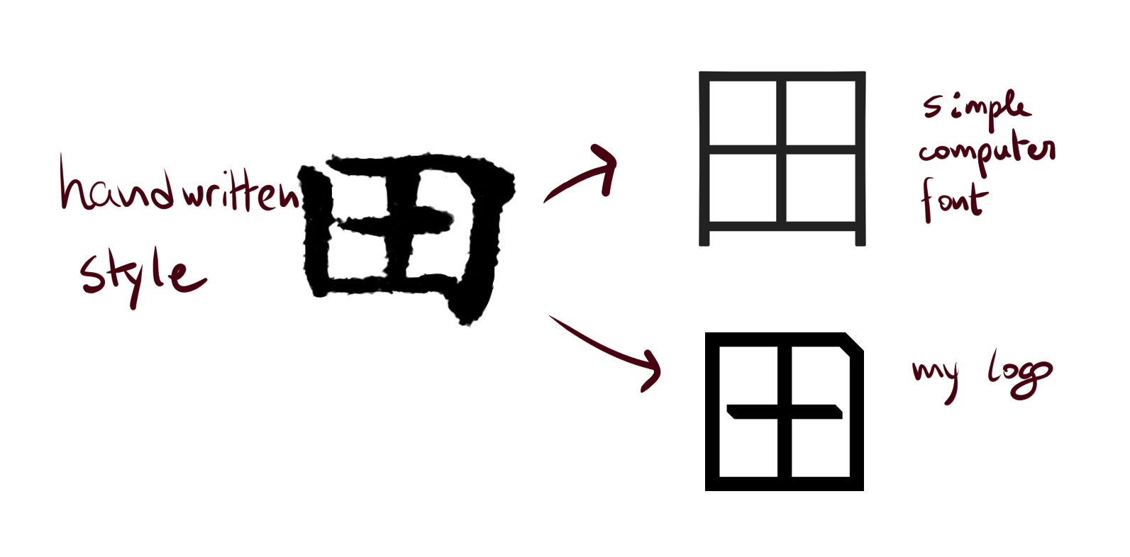
The logo I developed is related to one iconography that will always be with me, my name written with Japanese characters. My name is Bruno Daiki Yamada. Yamada is my surname, and Daiki is my Japanese name. Both are written in Japanese as 山田 and 大喜 respectively. For the first logo, I took the last character (kanji) from Yamada (田, pronounced as da) and transformed into a stylized and modern logo. You may think that the logo can be accurately represented as a simple empty square with a cross in the middle. Indeed, some modern stylized kanji do look just like that. But I like to change the shape just a bit for two reasons:
- To make it slightly different from the obvious option. Adding just enough details and flare can make it unique.
- To make the logo refer to its origins. I don’t want to simply add some random trappings and scribbles to make it more interesting. The small details that make it unique must help the logo be closely related to the original meaning.
Deep dive into the logomark design
Now, let’s take a look at the small details on the logo that makes it different from a simple square divided in four pieces:
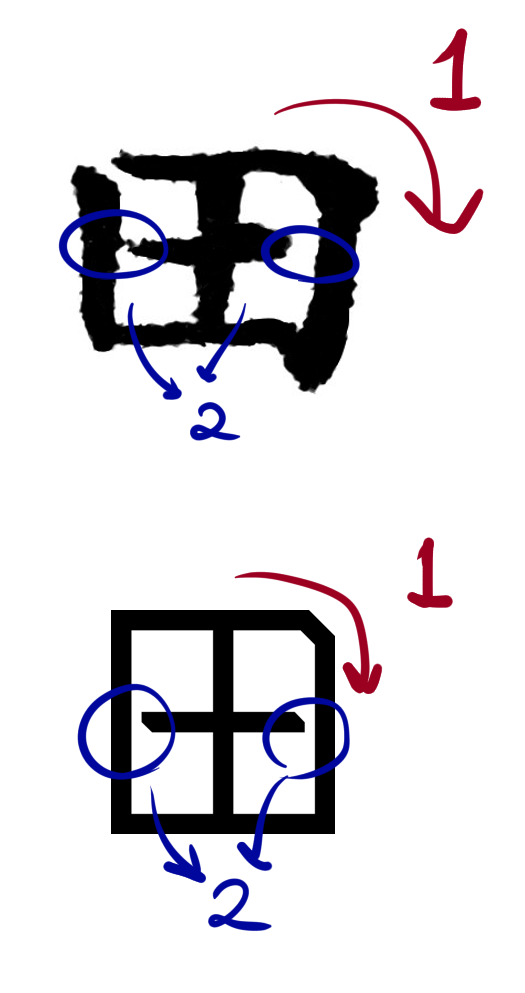
- The chamfer: When writing this kanji with the correct stroke order, this corner is the only one which may not be 100% straight and angled (see 1 in picture). When writing, the stroke make a curve instead. A 45 degree notch taken from this corner is meant to reference this quirk.
- Smaller horizontal stroke: In many handwritten examples, the da kanji is written with a full and complete vertical stroke, but the horizontal stroke is smaller and may not touch the outer square at all (see 2 in picture). This stroke also has two smaller diagonal chamfers that make it a bit rounder and in my opinion a bit more dynamic.
- Bold and monochrome: The bold design makes it easier to print and in makes it more visually striking. No multiple tones, colours or even shades of grey.
- Orthogonal and 45 degrees: The logo focuses mainly on 4 different angles of lines: vertical, horizontal, and these two directions tilted 45 degrees. This was mainly inspired by printed circuit board design, in which the paths within a circuit board are usually drawn along these 4 directions.
Now, taking into account all these concepts, I devised what I consider to be the final logo. Which I’m not entirely sure if it is super unique or not. Actually, it’s probably not, but I still like it, specially if I join it with my name to make a logotype.
Notes on the logotype & logomark

The da symbol is what we would call a logomark, a symbol with no letters. The idea is to join this icon with my name, easily legible to allow effortless recognition. I chose a rounded, simple and thin font to contrast with the logomark. Won’t lie, I love fonts like comfortaa.
Rubber stamps and self identity
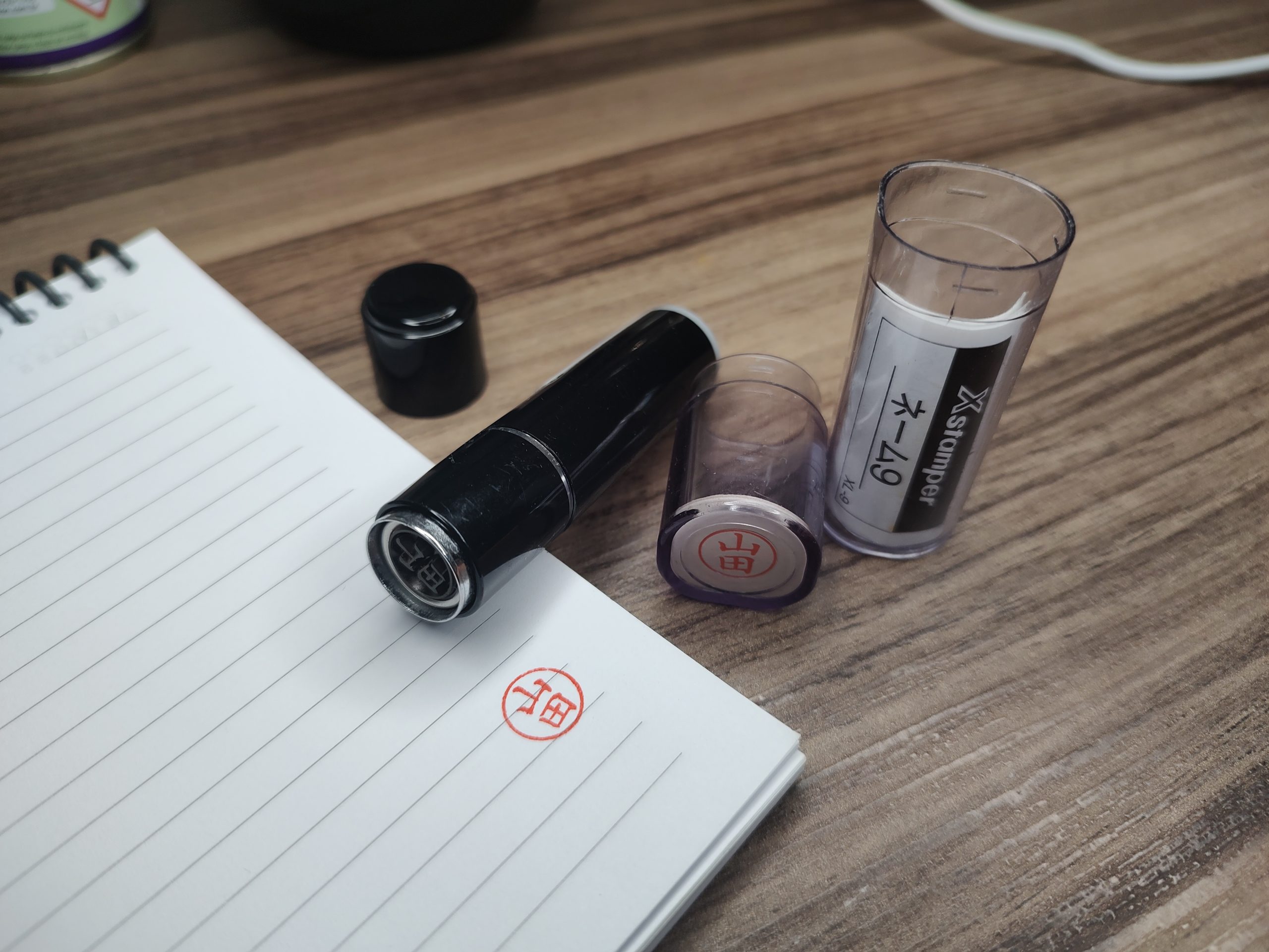
There’s a very interesting way of Japanese people to identify themselves for bureaucratic processes, such as signing documents. Instead of signing their name with a pen, they usually stamp the physical media with a small red seal, a stamp called hanko. Usually this seal contains the kanji used to write their surname. This is actually a widespread procedure in South East Asia.
I admit that don’t care much about the idea of needing to keep a seal on my person at all times for signing purposes. However, I very much liked the idea that this stamp can be used as a way of self expression and identity. So I wanted to make a modernized take on this bureaucratic tradition, which was really born out of necessity.
What a modern hanko looks like?
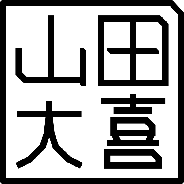
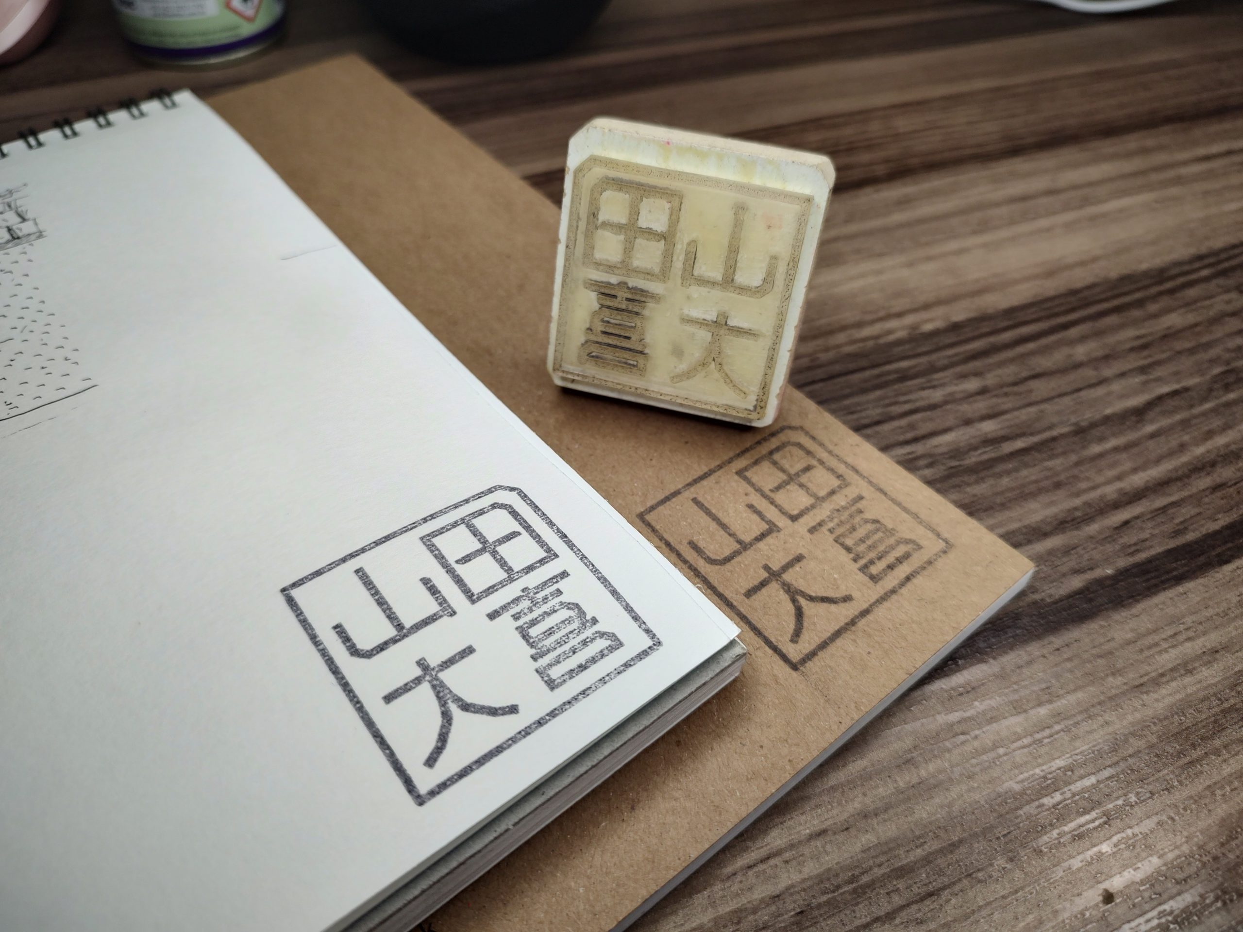
I couldn’t find many examples of what a modernized hanko design looks like. Even the stamps used today in Japan are mostly very traditional-looking. But I simply wanted to make one which fits with the visual identity proposal and also kinda fits in with real some real life hanko examples. This resulted in a stamp that joins all four kanji from my name plus surname in a square pattern. I stylized all kanji doing my best to fit into this theme I established, and I think it turned out very well.
The real life stamp ended up being about 4 centimeters wide and tall, which is pretty large for a real hanko (it’s usually less than 1 centimeter wide). This stamp however was never meant to be used as a paper signing method. But rather used as a approval stamp, or a quick way to brand stuff with my identity.
What else can you do with this logo?
The Box Video
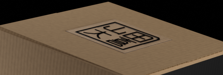
This is a simple 3D render of what a real life object with my visual identity could look like. It looks so real you can almost touch it. With this video I also explored some themes and possibilities I mentioned in the goals section. For example, I made a huge crooked logo hug two sides of the box (see picture) to add some personality to a otherwise very squarish and standard box. Also I enjoyed making a sticker using my stamp design to seal the box.

This 3D render was proudly made with Blender, following Derek Elliott‘s box folding tutorial, whose videos are always a pleasure to follow.